To begin a broad inquiry into the SGD's I would suggest starting with SAP's dashboard on the Global Goals. The dashboard is powered by their Lumira analytics platform and provides us with great visualizations for each of the 17 goals. You can further refine by country, so it would be possible to find data on how a given country is doing on all of the goals. If you want to go deeper with older students you can easily access more data by following the links under the Get Involved section at the bottom of the page. You might choose to download sets of data to present students for graphing and then comparing with the actual graphs to check their work.
If you are hoping for a more in depth exploration of a given SGD then a great place to start is the Global Partnership for Sustainable Development Data. Their Data in Action Roadmaps Toolbox, while designed primarily for use by government agencies, contains a great resource section on open data sources categorized by development goal in an easy to read table. I have edited the original PDF file, which is shared under a Creative Commons Attribution 3.0 Unported (CCBY3.0) license, and you can access the file below, and feel free to download it for your resources. It of course carries the same license for use.
The sites provided might be global in scope such as GODAN, which I highlighted in my last blog post, or more local such as New Zealand's LAWA website which provides data on land, air and sea quality at the country's beaches. There are plenty of resources that also discuss how data is being used to solve specific problems. These could make great case studies for your units to get students thinking about how they could use data themselves to solve a problem. Why not have students address a specific problem in their community based on collecting data?
This table has more resources than a humanities department could get through in 6 years, so hopefully there is something there to grab you and get your planning started. As always, I would love to hear your thoughts on how you are using data in your own classroom!
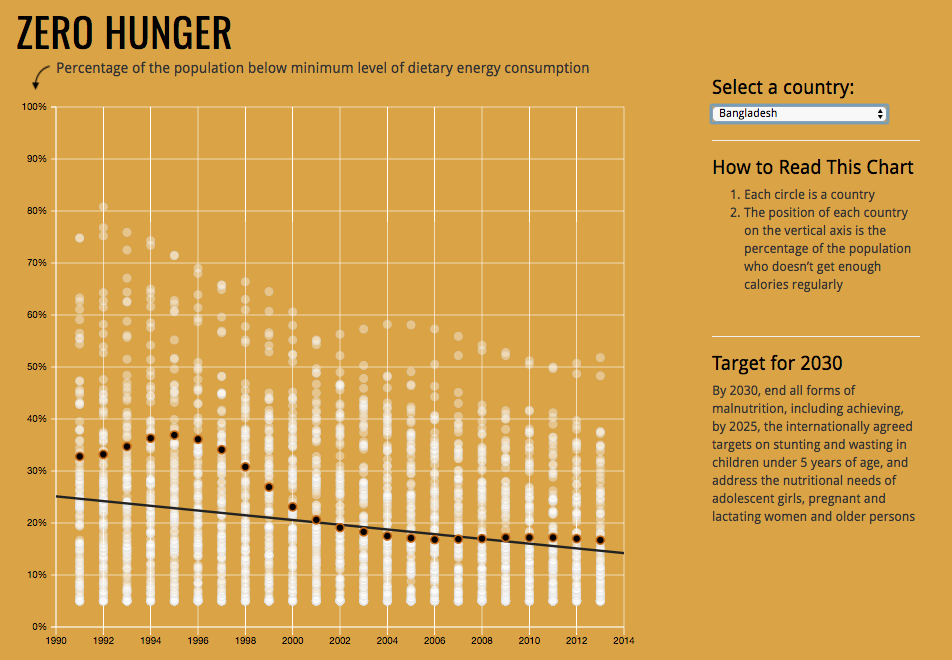
Here are some topics that you might be teaching that could lend themselves to using data on ending hunger:
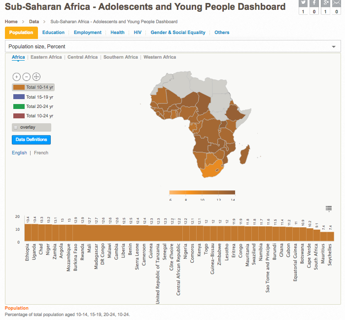
In an ongoing series of blog posts I am hoping to highlight some great online data resources for use in the classroom. One of the biggest problems is accessing relevant data. Unfortunately, this is often a problem because government agencies do not have good transparent data. Much work is being done in correlation with the SGD's and hopefully we will see more data become available online. Today's highlight is on the dashboards available from the United Nations Population Fund (UNFPA). According to their website the "UNFPA is the lead UN agency for delivering a world where every pregnancy is wanted, every childbirth is safe and every young person's potential is fulfilled."
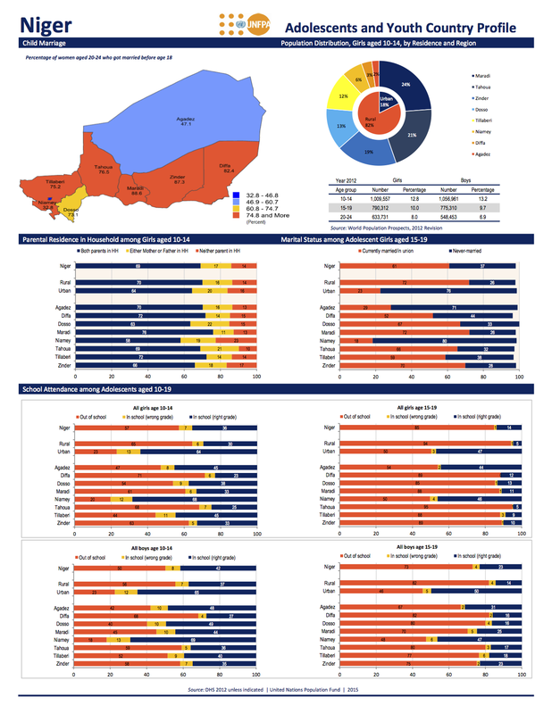
The data is even broken down by region with the countries. This could allow interesting studies in relation to events within the country. Why for instance does the northern half of Niger have almost half the amount of women aged 20-24 married before 18 compared with the southern half of the country? Ask your own questions, or better yet, have students generate their own!
As with all population data, the number of indicators and the amount of data is what makes it difficult to access. These tools can help with providing relevant details for discussions of various issues in the classroom, or accessing the data itself and creating visuals can be the learning engagement. As always, real world data is far more compelling than data that was created just so that there would be something for homework!
Here are some possible lesson and unit ideas to help get your planning going, and please share any ideas you have in the comments:
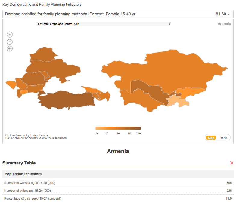
It has been quite a while since I have posted anything on the site. Two babies in two years will rearrange your priorities a bit! However, I am in the middle of a year off from the classroom and have fixed our old house up enough to actually have a bit of time to write about using technology in the classroom again. I am hoping that this will be able to be a bit of a series about using data in the classroom. To kick it off I'm simply sharing a great resource for accessing statistics about Europe and Central Asia. The TransMonEE dashboard will allow you to access data about the status of children and women from various countries and will provide the statistics in an easy to access dashboard. 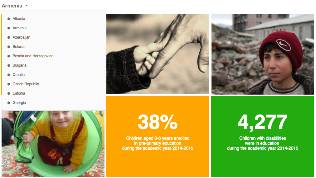 screenshot of Transmonee dashboard This can be a great way to either access data for processing or as an introduction to various social issues. If you want the raw data you can access their database as well. In the future I am hoping to design a more robust unit for middle school humanities, but for now, here are some ideas on how you might be able to integrate this into your classroom.
Thats just a few ideas for now. If you end up using the dashboard, I would love to hear how you used it in the comments below! 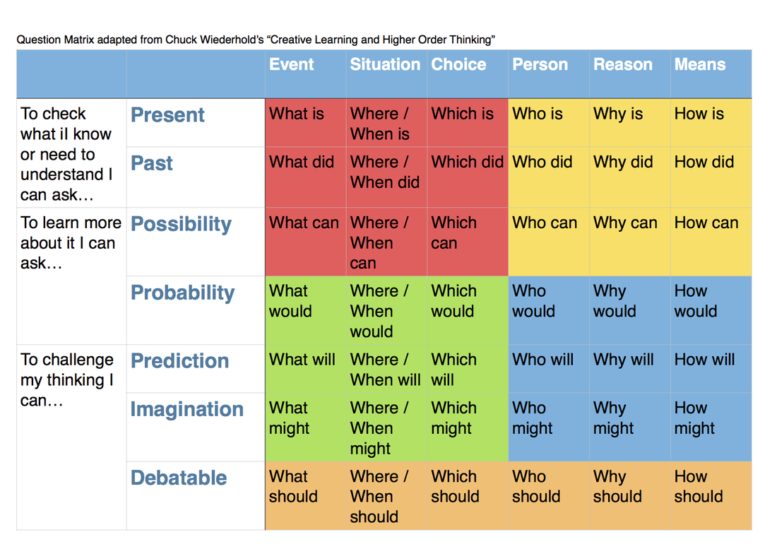
In MYP unit planning, the MYP identifies three types of inquiry questions that can guide student inquiry. These questions can be factual, conceptual, or debatable. There is no hierarchy of importance between these categories of questions, though one could argue that conceptual questions require higher order thinking skills, and debatable questions higher still. I would not argue that this is always the case, rather that the more important idea is to have a balance of appropriate questions to guide student inquiry and learning.
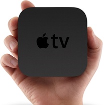
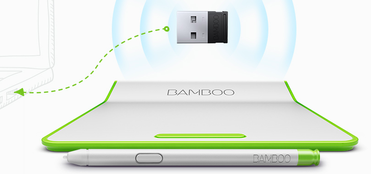
One tool to help further thinking through questioning is Wiederhold's Question Matrix. This matrix can help channel questions from more closed to open. If you look at the red quadrant above you will notice that the questions are more factual. The yellow and green quadrants may overlap between factual and debatable. The blue quadrant is more solidly conceptual in the types of questions produced. These four quadrants were originally proposed by Wiederhold, and I would say he was off to a good start. However, in discussing this matrix with a few other MYP educators (Thanks Kim and Ashish!), we realized that there was no real debatable starters. I would propose that we add an extra level on the vertical axis to enrich each of the columns. By introducing 'should' we give questions the option for value judgement, which allows exploration of more than one side of an issue. Overall, we might consider factual questions to be questions with a single, or narrow range, of right answers, such as "what is an atom?". There are more than one atomic models, but the answers are all within a narrow range. Conceptual questions on the other hand have multiple possible answers, each being equally possible. A question of this sort might be "how has our understanding of the atom changed the world?". There are many ways the atom has changed the world, from nanotechnology and material sciences to nuclear reactions and energy. Each may be explored in depth and all have equal footing. To shift to a debatable question requires the addition of a value judgement. So our question about atoms might become "what is the most important change that has arisen from our understanding of the atom?", or if we use the chart above to form the question we might ask "who should decide how we use our knowledge of atomic energy?". These additions of a value statement shift from multiple correct answers, and requires the inquirer to make a decision and justify it. This relates closely with the DP's Theory of Knowledge course's knowledge claims. Personally, I like to tell my students to "get off the fence" and make a choice. Hopefully this might help you shape inquiry questions for your own classes. Or, even better, use it with your students to start off your inquiry and refine it along the way.  I have never really liked interactive whiteboards. Let's get that out of the way. If you do love them, then this post isn't for you. This post is for: 1) those who want an interactive board, or 2) those who want an updated overhead projector. Wow, I miss that old beast of a machine sometimes. I loved how I could interact with the students when I used it. You could diagram or write notes all without ever having to turn your back on the students. They also used to love writing on it and seeing the results up on the screen. I think I have finally found a replacement for the old machine thanks to a combo of Notability, an Apple TV, and my Bamboo pad. I will admit, this is a bit of a costly one, but for under $200 I feel that I have a solution that is superior to interactive whiteboards, and far cheaper.
The first piece of the puzzle is the Apple TV. I have it hooked up to the projector in my room that the school provides. With the Apple TV I can mirror my computer screen with a quick button push (you may need an addition program if you're running a Windows machine). Next is the combo of Notability and my Bamboo pad working together. Notability provides a great environment for marking up PDFS, images, or creating notes from scratch. The Bamboo pad allows me to use a stylus and write in a natural way. What results is an interactive document on the board. This note can then be exported at the end of the lesson and shared with students.
Notability overall is a great app. It allows the easy import of multiple PDFs, so you could use it for marking up student work. You can record audio along with your note if you're taking minutes at a meeting. The pen feels natural, and the colors are great!
My only complaint about the program is that there are no auto shapes. If there was a line tool I would love it. If there were also arrows and simple shapes it would be amazing! Currently you will need to import an image if you want any simple shapes. I recommend using the still-in-demo version of MyScript if you want to draw the shape, then screenshot the image to paste into your note. Happy note taking! |
Welcome to The MYP Teacher and
|


 RSS Feed
Photos used under Creative Commons from the measure of mike, postscapes, PhoTones_TAKUMA, James Jordan
